
UX for Fintech
Client: Guiabolso | Brazil | iOS • Android • UX Research
A financial planning app with more than 5MM customers. I was a Product Designer leading internal product investigation, developing and conducting UX research as well as spreading knowledge about our users which informed several Guiabolso's product teams
CRM UX Research Sprint
Our CRM team organized a one-week “CRM Sprint” in which the main goal was to create a 7-day CRM content material that made the most sense to new users on their first week using the app.
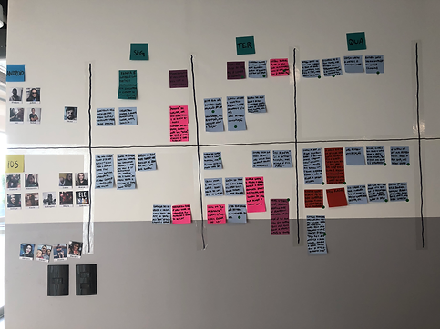
THE RESEARCH
Method
Diary Studies to keep track of participant's thoughts, experiences, and activities over a week
Sample
People who have recently become our users (no more than 2 weeks) received an invitation to participate via email 7 days prior to the start of the CRM sprint. We were able to recruit 11 iOS users and 5 Android users.
Communication Tool
Whatsapp: due to high adoption rates in Brazil and easy to share voice notes and media files

THE UX RESEARCH
KEY FINDINGS
1
Almost nobody considered Guiabolso an app that needed to be used daily;
2
Participants said they used the app only to check their balance and statement as if it were a control panel
3
Users that did come back were using the “Wallet” feature to keep track of their cash expenses;
4
72% of participants create goals and like them to achieve their goals, but realize that they have flaws.
5
40% of participants don't know that you can create a personalized category, even though we know this feature makes them return to the app (FAILURE)
6
The "Guide" tab was positively received, people liked its content, especially when it was interactive or provided tips on extra income and bank fees.
NEXT STEPS
1
-
Improve the onboarding experience of features that are being neglected, such as the Guide tab.
-
Create strategies for users to interact with the app – to increase the frequency of use.
-
Study the engagement potential of the "Wallet" feature
2
The Planning feature is fixed for every month, our users would like it to be possible to make specific changes for that month.
KEY FINDINGS
The Wallet feature makes the user return frequently, but it's not easy to access and doesn't have good usability. They say it is difficult to create an expense.
3
Only 1 out of 5 Android users realized that the "Guide" tab provided customized financial tips.


Studying the iOS Manual Wallet Feature
According to Guiabolso's Data Science team, users who enter expenses manually are more engaged, positively impacting MAU (Monthly Active Users). Furthermore, according to a 2018 Central Bank survey, 96% of Brazilians use cash, mainly for small purchases, carrying between R$20 and R$50.
That said, a question emerged: Could we optimize user retention and platform utilization by actively encouraging more users to utilize our Manual Wallet feature?
RESEARCH METHOD
Primary Data Analysis
Metrics and analysis done with Looker, Data Science team and Databricks
User Interviews - iOS | Android
Telephone interviews (12 users) to understand the relationship between people and cash in their daily routines

INTERVIEW RESULTS
1
Half of the interviewed Users said they didn't know that it was possible to manually control cash or card that can't be synchronized in the app (FAILURE)
2
They only use cash for small purchases (coffee, bakery) or when they know that the place does not accept cards or the machine has a problem.
3
Money is plan C for reasons of convenience/urgency, security and control (POINT OF ATTENTION)
4
Users have a manual account to control accounts/cards/investments/VR that we do not currently synchronize (OPPORTUNITY)
5
When withdrawing an amount to pay for something specific, it's easier to just recategorize that amount with its ultimate goal. (OPPORTUNITY)
6
Most users (10/12) do not post the expense as soon as it happens. They keep it in their "heads" or write down the expense in a notebook/cell phone, despite finding the entry flow simple. (FAILURE)
DATA FINDINGS
1
Users who posted over 6 transactions per week had a 90% chance of returning in the next 7 days, identified as the "Magic Number.
2
Spending efforts on the wallet feature may not be justified:
TEAM CONCLUSION
Performance Metrics: the time to launch Wallet Screen is approximately 20 seconds X writing expenses in Notepad takes less than 5 seconds.
-
Money is a plan C for users, indicating less priority for frequent interaction.
-
Transactions occur sporadically.
-
Only 4.5% of all users (iOS and Android) utilize the wallet feature.S.
3
Only 4.5% of users (iOS and Android) use the wallet feature, with less than 1% on iOS.

